admanGo
Hatted Roof
Bean Buro was tasked with designing a new workplace for admanGo, an advertising and advertisement monitoring company in Hong Kong. The workplace located in an office block on Queen’s Road East in the busy district of Wanchai. The brief was to create a new, fresh, and comfortable workplace for the company employees, many of whom work long hours. The previous office space was felt tired and dated, with conventional work cubicles that segregated individuals and did not provide synergy between the company and its employees. Thus it was important for the new workplace to engage with its employees through means of comfort, interests, aesthetics, materiality, to nurture a better company culture and to improve employees retention. The project would have limited budget and time, hence it was important to provide a highly cost effective solution, with innovative construction methods to cut down on site works and duration. Branding services was required for the company business cards, to create a holistic identity with its new workplace.
Bean Buro Team: Lorène Faure, Kenny Kinugasa-Tsui, Pauline Paradis, Tommy Hui, Aimée Daniels, Mathilde Jourdes, Abby Liu, Isaac Tam, Philippine Vidart
Main Contractor / Project Manager: Winsmart Contracting Co. Ltd
Client: admanGo
“We wanted to send a huge thank you to Bean Buro for the design of our new office. We’ve moved in for about a week (only) and we’ve heard numerous compliments about the office from colleagues and friends alike. Thanks again!”
— Jennifer Ma, director, admanGo Limited
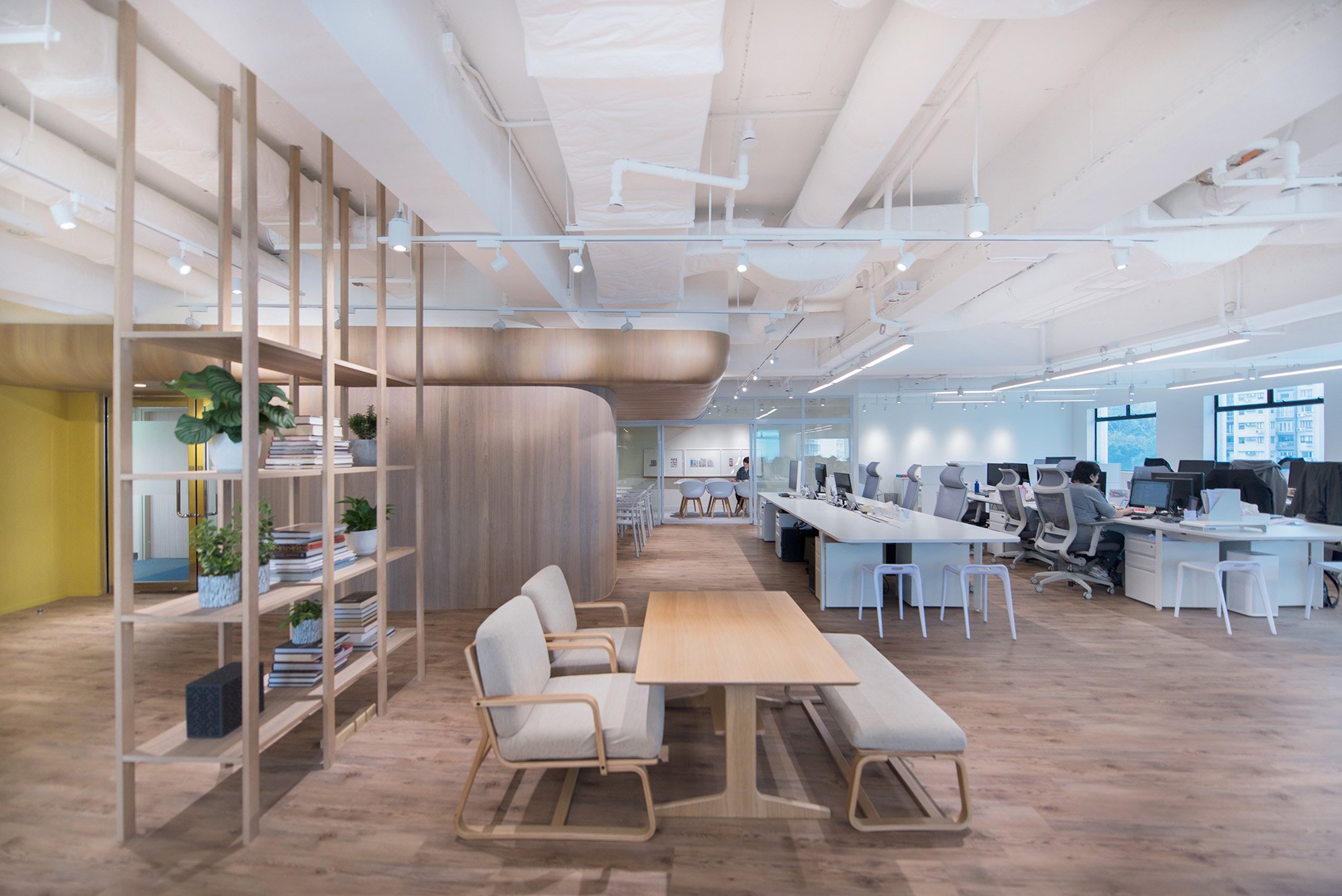
A wooden flooring starts from the reception that continues throughout the workplace; from the wooden landscape it is risen to form a powerful backdrop as a large sculptural wooden volume, like a hatted roof which provides sheltering over the pantry, social break out areas, and a meeting room. This central feature creates the anchor point for the entire workplace where everybody would pass by and come together. It creates a sense of place for the employees and a unique identity for the workplace.
“In the temples of Japan, on the other hand, a roof of heavy tiles is first laid out, and in the deep, spacious shadows creates by the eaves the rest of the structure is built. Nor is this true only of temples; in the palaces of the nobility and the houses of the common people, what first strikes the eye is the massive roof of tile or thatch and the heavy darkness that hangs beneath the eaves. Even at midday cavernous darkness spreads over all beneath the roof’s edge, making entryway, doors, walls, and pillars all but invisible. The grand temples of Kyoto—Chion’in, Honganji—and the farmhouses of the remote countryside are alike in this respect: like most buildings of the past their roofs give the impression of possessing far greater weight, height, and surface than all that stands beneath the eaves.”
— Jun'ichirō Tanizaki, In Praise of Shadows (Leete’s Island Books, 1977)
The sculptural wooden volume, which was nick named the Hatted Roof, was inspired by traditional oriental architecture; In Japanese temples and traditional thatched houses, shadowed spaces were created under the sculptural roofs for sheltering, but also as a symbol of security and support. While Western architecture was about the desire for creating maximum height (such as those of Gothic Cathedrals and traditional manor houses), Japanese architecture was more about the deliberate creation of compressed spaces for a play of different heights, densities and thresholds.
Here Bean Buro has interpreted the weighted sculptural roofs of the Japanese temple as a large sculptural volume for the social pantry cafe and meeting room with a large ‘roof’ that is elevated, and it creates shaded spaces underneath that symbolises a sense of protection, comfort and calmness. Located as a central piece in the backdrop of the workplace and physically connected to the entrance, the Hatted Roof serves as a magnet that attracts employees to come together, to breakout from their usual work clusters, to use the shaded pantry cafe or meeting room that it creates, and heightens the sociable atmosphere in the workplace. The Hatted Roof is entirely lined in timber oak veneer, with subtle lighting design and an internal yellow wall to energise the cafe space. The yellow wall would extend into the meeting room, which is enclosed by a gallery wall, a painted writable wall, and sliding glass partitions.
Huddle spaces were also created at the ends of each work cluster, where a couple of stools can be pulled out for informal discussions. Social lounge furniture have been integrated into the open plan for further break out opportunities. The overall open space is light filled, with unobstructed views into the heart of the city that can be enjoyed by all employees.
“Located as a central piece in the backdrop of the workplace and physically connected to the entrance, the Hatted Roof is a central magnet that attracts employees to come together, to use the pantry cafe and meeting room that it creates, and heightens the sociable atmosphere in the workplace.”
— Lorène Faure & Kenny Kinugasa-Tsui, co-founder of Bean Buro
Portal entrance
The spatial composition of the workplace is rooted in the interpretation of a traditional gated tea gardens, where one would first enter into a foyer through a compressed portal entrance, before opening up into a higher ceiling in the reception space. The reception is a welcoming space with an informal reception desk made in timber, with a porous bookshelf lattice on the left, and a yellow coloured wall on the right designed with an artwork of the ‘Ad Man’ - the silhouette outline of a detective wearing a hat, which is a symbol for the company. The overall layering effect is one that is rooted in Japanese gardens, where the experience of passing through thresholds and visual connections through porous elements would create an illusion where spaces are seemingly larger than it actually is within the confined perimeter of the site.
The materials colour palette is predominantly high-quality timber, with muted green and blue hues, and white gallery walls for artwork. Various bespoke details are incorporated in the joinery design that accentuates a hospitality atmosphere for the front of house areas of this spacious apartment in Repulse Bay Hong Kong.


