L’Oréal
One Hong Kong
L’Oréal, the world’s largest personal care company, has appointed Bean Buro to design their Asia Pacific headquarter in Hong Kong spanning over 5 floors with an internal staircase in an existing office building at the Harbour Front of Hong Kong Island. The design brief called for a highly collaborative working environment for the company’s 800 employees to be connected across different departments, to reinterpret the company’s French roots in Hong Kong, and to explore innovative workplace solutions to promote wellbeing and work style flexibility. The office would be named “One Hong Kong” for the vibrant community of employees.
Bean Buro team: Kenny Kinugasa-Tsui, Lorène Faure, Pauline Paradis, Kirk Kwok, Mikaela Black, Isabel Entrambassaguas, Elspeth Lee, Abby Liu, Jay Jordan, Philippine Vidart, Isaac Tam, Linda Sze-To, Michelle Ho, Tommy Hui
Main contractor: James Rice Constructing Co. Ltd
Acoustic consultant: Marshall Day Acoustics
MEP consultant: WEC Engineering
AP+RSE: JM & Associates
Project manager / change management: Colliers International
Client: L’Oréal Hong Kong
Area size: 61,000sqft (5,700sqm)
The project involved Change Management, to explore the process and systems to manage employee engagement and adoption of the organisational changes to how work will be done. Bean Buro assisted the Change Management specialist in a series of design workshops to engage with different departmental heads and stakeholders.
The design would honour the company’s global sustainability guidelines, and maximise building performance to reduce carbon footprint. The company’s new digital workplace goals will reduce consumption, ensuring the space will remain “green” over time.
A narrative of ‘Parisian streets’ and ‘traditional Chinese gardens’
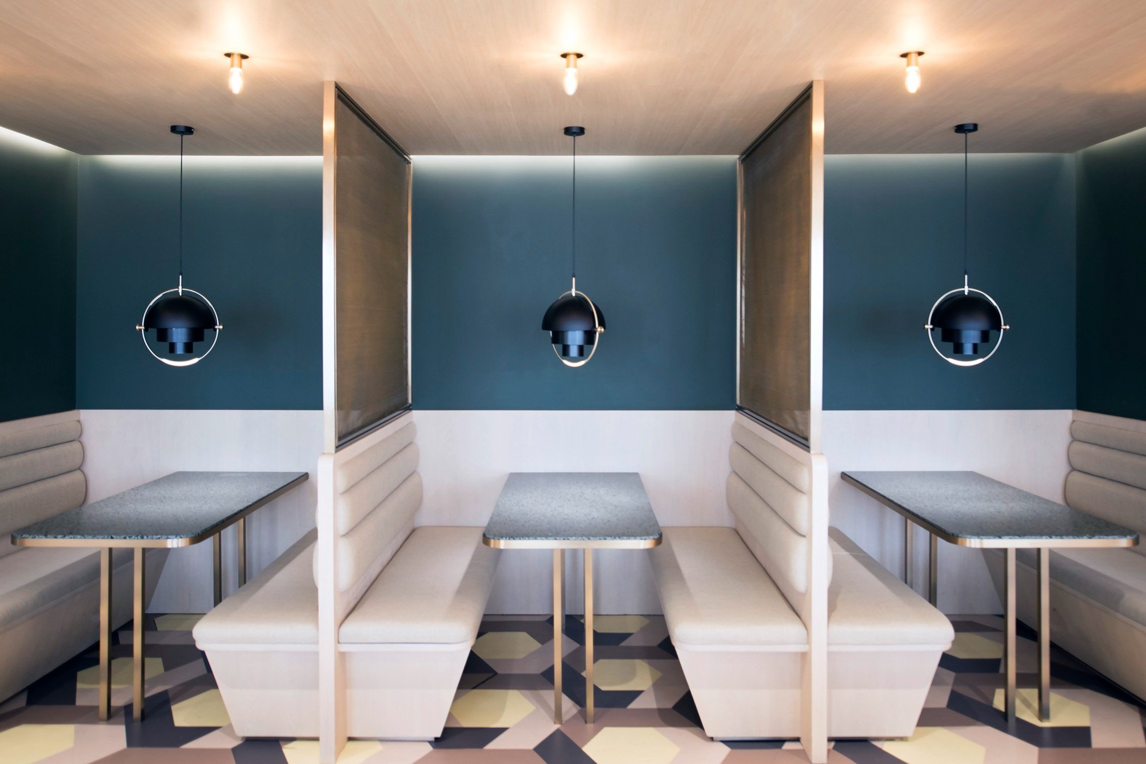
The narrative is an exchange between the interpretations of the Parisian street scenes and traditional Chinese gardens. In the city of Paris, many Parisians would socialise in their neighbourhood cafes with seating arrangements orientated towards the street view, watching the day go by. The idea of ‘inhabiting’ the perimeter of urban blocks, in between inside and outside to benefit from natural daylight and views, serves as the main inspiration for the social settings in this project. On the other hand, we drew poetic inspirations from traditional Chinese Gardens, which have various circulation cloisters with timber ceilings and slatted screen walls, as architectural devices to differentiate public and private spaces, and linking all the neighbourhoods together to create continuity and harmony.
“In the city of Paris, many Parisians would socialise in their neighbourhood cafes with seating arrangements orientated towards the street view, watching the day go by. The idea of ‘inhabiting’ the perimeter of urban blocks, serves as the main inspiration for the social settings in this project.”
— Kenny Kinugasa-Tsui, co-founder of Bean Buro
A workplace strategy for maximum interaction
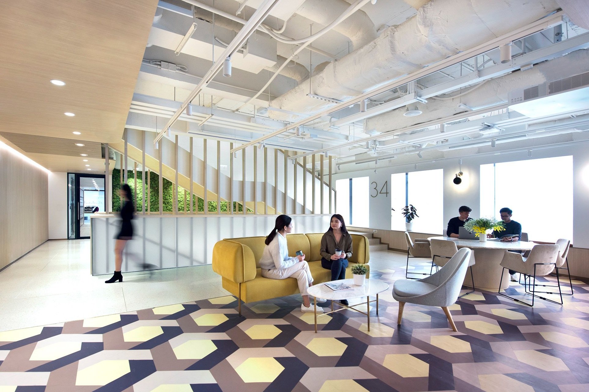
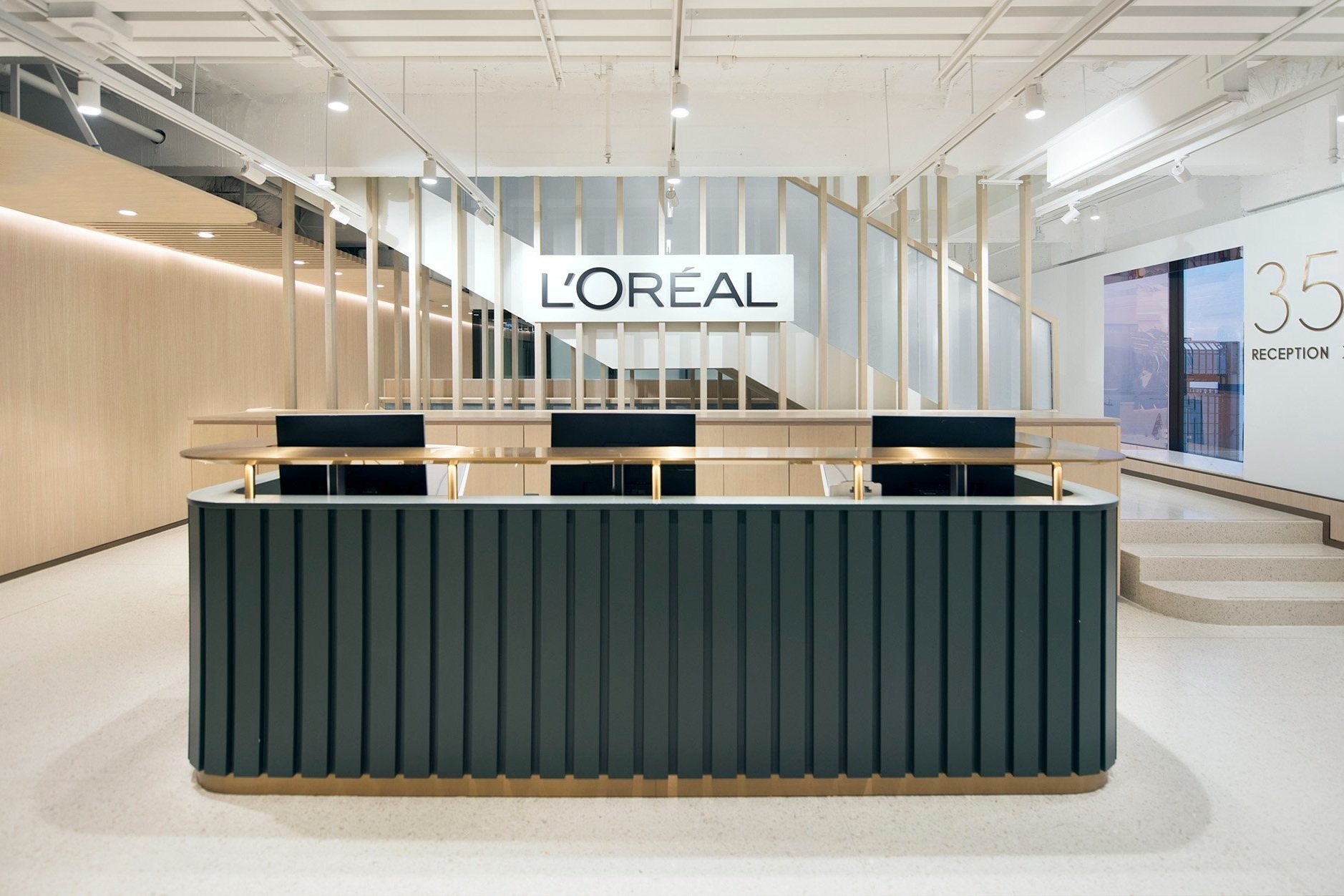
The main strategy was to utilise the staircase as a ‘magnet’ to bring people together, around which social spaces, meeting spaces and departmental neighbourhoods are constellated. The staircase volume is clad in full-height vertical timber slats that rise dramatically from the lowest floor level to the highest floor’s ceiling slab — acting as a strong and legible architectural connective element for four floors of the company.
The main reception is located on a mid-floor to increase chance encounters, while there is a large cafeteria named the ‘Central Cafe’ with a variety of furniture for small to large ‘townhall’ gatherings on the lower floor.
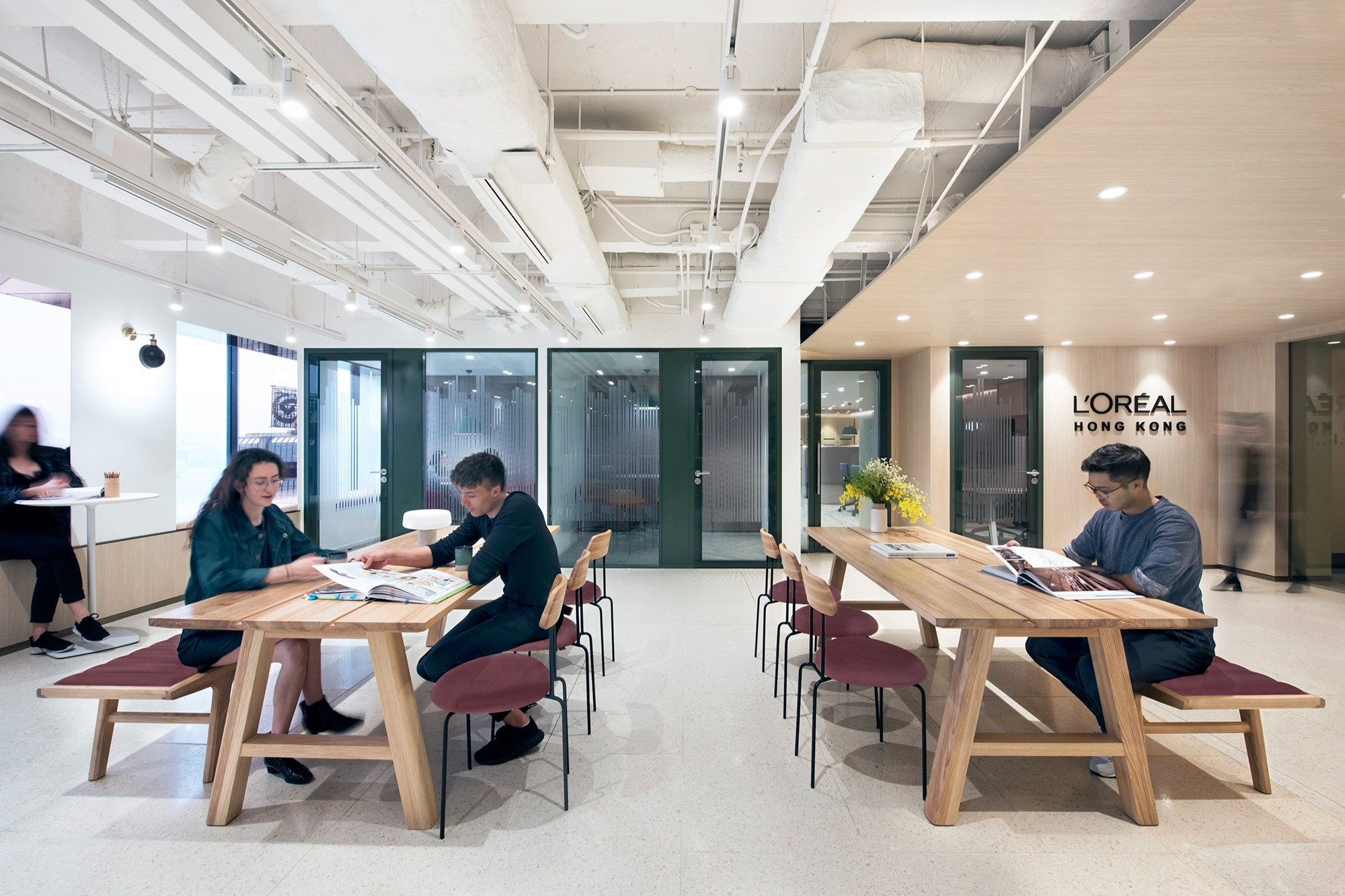
Open collaboration spaces and meeting rooms are immediately located around the central staircase on each floor, with a continuous timber wall and ceiling that roofs over these spaces to create a warm, humanistic atmosphere. These social spaces are equipped with water points, loose movable furniture, power points, with close proximity to the beautiful harbour view of Hong Kong.
Cushioned seats are created at the window sills of each bay, allowing 1-2 employees to temporarily catch up or relax. These window bays are lined with tinted mirrors, allowing the cityscape to be better appreciated while increasing the diffusion of natural daylight into the interior.
Various wayfinding signages are designed to guide users to circulate from the front of house areas into the departmental ‘neighbourhoods’: each has a vertical full-height joinery display unit that serves as a ‘landmark station’ that can be branded with the department’s products, and support facilities such as meeting rooms and phone booths that are easily accessible within each neighbourhood.
“The main strategy was to utilise the staircase as a ‘magnet’ to bring people together, around which social spaces, meeting spaces and departmental neighbourhoods are constellated.”
— Lorène Faure, co-founder of Bean Buro
Beauty matters
Beauty matters in design, especially for this personal care company that carries some of the most renowned cosmetic brands in the world. Like skincare, the concept of the materials is to have a clean ‘foundation’ that is natural and neutral, composed of high-quality natural timber and terrazzo stone tiles.
On top of this foundation is a variety of highlights to express different social conditions, such as muted green and pinks to ‘blush’ collaboration areas, while brass details and warm-hued fabrics energise the front of house and Central Cafe. Intricate details of metal edging, trimming, and panelling effects are subtly incorporated into the joinery design for a high-end hospitality feel.
The colour scheme was carefully controlled throughout the project to ensure elegancy and coherency, with subtle distinctions in colour for the different floors to improve visual identification and intuitive wayfinding.
Wellbeing and green materials
Lighting and acoustics are carefully designed to facilitate a wide range of activities in a compact space. In collaboration with the specialist acoustic design consultant, a system of acoustic partitions is constructed in varoius materials to enable visual connectivity across the workplace while retaining acoustic separation.
The environmental design prioritises users’ wellbeing to improve air/water/light/sound qualities, while the construction and running of the building prioritises reducing carbon footprint and energy consumption. The project targeted a high degree of sustainability strategies, from environmentally friendly material specification to waste management.
A rigorous engagement process
The challenge for this project was in managing an engagement process that would ascertain the design could incorporate different bottom-up ideas from the company’s various departments, while striking a balance with management and senior stakeholders’ visions.
The design process was therefore highly iterative in order to explore the full potential of the project. A conscious control in aesthetic was required by the design team throughout the design development, so as to ensure the design would come together successfully.


