Paediatric Clinic x Painter’s Studio
Wellbeing Playscape
Bean Buro was appointed to design a 1,000sqft private clinic specialised in paediatric orthopaedics and scoliosis in Hong Kong. The specialist doctor and owner wanted an atypical clinic that feels welcoming to children and parents, as well as encourage the patients to interact with the environment which would enable the doctor to observe the natural body movements.
“We created an unusually warm and playful atmosphere for this specialist clinic; young patients would interact with the floor trail and climbing platforms, which in turn helps the doctor better observe the patients’ natural body movements as part of the consultation process.”
— Lorène Faure, co-founder of Bean Buro
The Narrative: Spatial organisation along a ‘spine’
Inspired by the medical disciplines of orthopaedics scoliosis, the space would be ordered by the idea of a ‘spine’ that runs across the floor space, organising the functional spaces along with it, such as the consultation rooms and customer waiting areas.
The narrative would also respond to the doctor’s love for painting, and create various artistically driven ideas, such as the creation of a painter’s studio, art gallery and event space.
The Process: Designing with patients’ emotions
The design process involved a thorough understanding of the humanistic experiences and the range of emotions that could occur in the clinic between the doctor and the patients, who are often young children accompanied by their parents.
Simultaneous consultations could happen at the same time, and one child seeing another distressed, or hearing crying, could lead to a stressful experience. Therefore, acoustic considerations had to be well thought out, while preserving maximum visual connectivity between the doctor’s consultation office and the patient’s waiting area, where the doctor could indirectly observe a child playing and moving about.
The Solution: A playful & artistic consultation experience
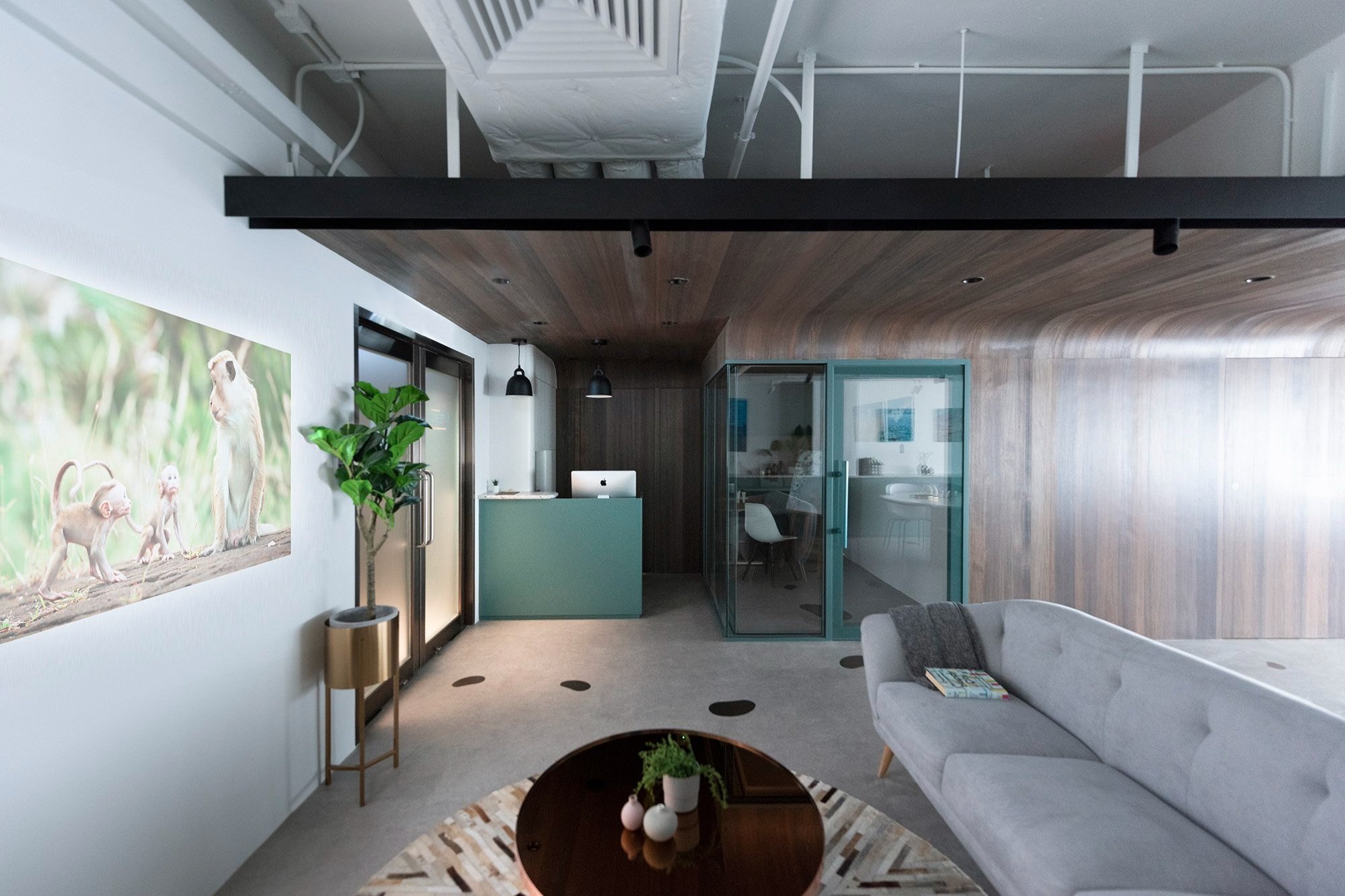
Creating the most relaxing and welcoming customer experience was a key driving factor for the spatial composition. The entrance reception is a homey lounge setting with comfy furniture, a projection screen playing nature imageries, as well as relaxing music and scent from air diffusers.
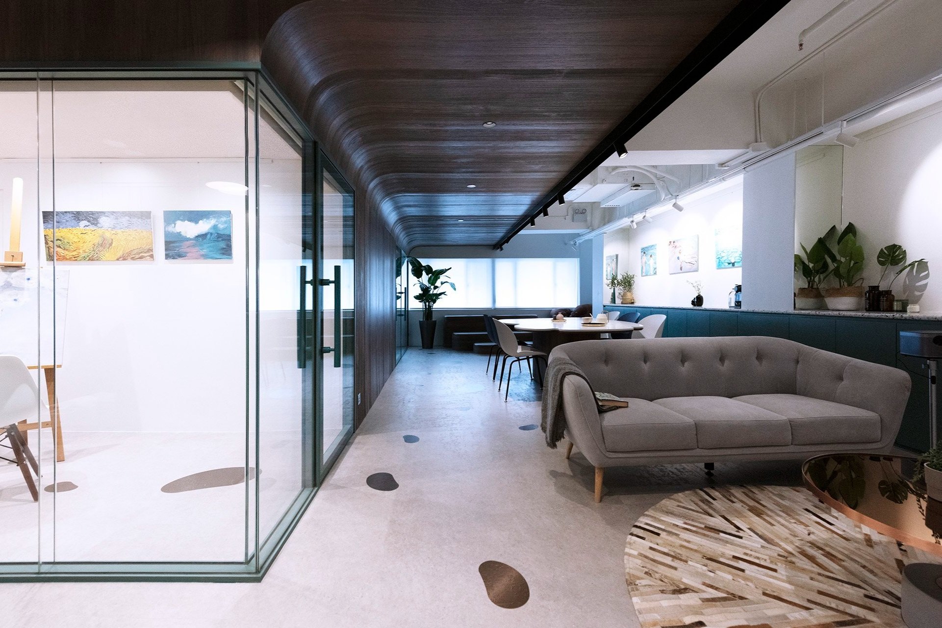
The floor is divided by a sculptural timber partition that divides a large open customer space from the doctor’s consultation office, examination room, and a painting studio room. The timber partition curves at the top to form a canopy which has a long black linear lightbox that runs down the open space like a ‘spine’ and provides cosy lighting for the customer space
“This is a special clinic where the doctor can also carry out his passion for painting and display his pieces on a gallery wall. The key feature is a long timber wall that serves as a ‘spine’ that organises the functional spaces along with it.”
— Kenny Kinugasa-Tsui, co-founder of Bean Buro
In the centre of the customer space is a co-working inspired sharing table in Bean Buro’s signature curves which acts as a central island unit.
Various bean shapes in a metallic finish have been randomly integrated into the concrete floor finish and acts as a playful discovery trail for children where they would be required to make large steps or jump in between the bean shapes.
The trail leads to a timber stepped platform which serves as a small playground for the child patients to climb on. The doctor would be able to observe the children’s natural movement as they play in their most relaxed state—replacing the typical formal consultation room setting, which would be stressful and stiff.
The Materials: Warm, homey & ‘non-clinical’
The materials colour scheme references a homey environment that is soft, textured and warm, to stray away from the typical ‘clinical’ white setting. The feature wall is constructed in timber, while the floor is finished in concrete, accented with bean shapes in a bronze metal finish to create the walking trail.
Various bespoke joinery has been spray-painted in a green lacquered paint to inject some colour into space. A long white wall has been created as a gallery to display the doctor’s paintings, accentuated in the space with exhibition-grade lighting.
The doctor’s office has a unique consultation table that has a leather pad inset, on which patients can rest their elbows comfortably for examination.
Well-Being & Sustainability
The materials selection process prioritised environmentally friendly materials, such as low VOC materials, and energy-saving lighting products. Biophilic design has been incorporated via the FF&E selections of indoor plants to improve air quality as well as serve as visual stimulation. To relax the patients, soothing music and air diffusers with relaxing scents have been incorporated into the design.
Main contractor /project manager: Winsmart Contracting Co. Ltd
Client: Paediatric orthopaedics and scoliosis clinic
Location: Central, Hong Kong


