Yakinikumafia
Airport Affair
Bean Buro was tasked with the design of Yakinikumafia on Hollywood Road in Sheung Wan, Hong Kong, a restaurant brand from Japan specialised in high-quality yakiniku ("grilled meat"). The floor space is situated in a vibrant district in the heart of the city, where there is a mixture of residents, tourists and office workers. The neighbourhood of Sheung Wan especially has a strong characteristic of art, antiques, nightlife and restaurants. The restaurant would have booth seating where food can be cooked directly at each booth, a standing bar in front of an open kitchen where chefs can serve the customers directly, as well as a couple of VIP rooms for exclusive in-room cooking parties and function events. The restaurant was designed and constructed throughout the lockdown. It opened just as the city began to ease its restrictions. The client's ethos was to ride out the contextual challenges, entice new customers and support the communities of farmers and producers.
Bean Buro team: Lorène Faure, Kenny Kinugasa-Tsui, Lelia Ku, Jay Jordan
Main contractor: Dongde Decor Limited
Client: Yakinikumafia
Location: Sheung Wan, Hong Kong
Area size: 2,099 sqft (195 sqm)
“We created a poetic narrative drawn from the nostalgia, excitement and glamour, where the airport was considered as a highly theatrical space for humanistic exchanges.”
— Kenny Kinugasa-Tsui, co-founder of Bean Buro
The Narrative: Nostalgia and Glamour of Travel
We created a poetic narrative drawn from the nostalgia, excitement and glamour of air travel, and borrowed subtle references from films such as The Terminal, Catch Me If You Can, and Blade Runner, where the airport was considered as a highly theatrical space for humanistic exchanges. It was about how people would intuitively experience a transient space full of airport signs and information boards. The space is considered as a lively terminal of 'travelers' in motion, where some people may be in a rush, while others may have time to kill—to watch and be watched.
“The restaurant was designed and constructed throughout the lock down (due to the Coronavirus), and opened just as the city began to ease its restrictions. The project’s ethos was to ‘ride out’ the contextual challenges, entice customers and support the communities of farmers and producers.”
— Lorène Faure, co-founder of Bean Buro
The process: Expressing the Ceiling Slab Architecturally (like Oscar Niemeyer)
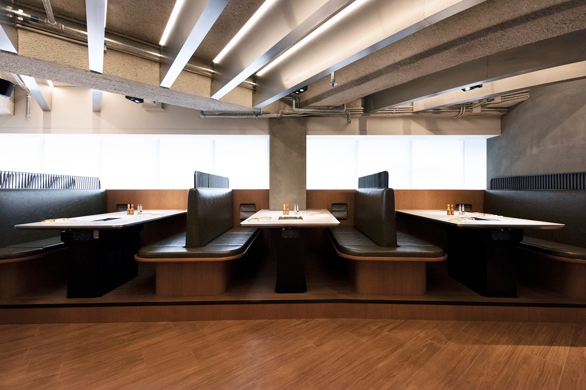
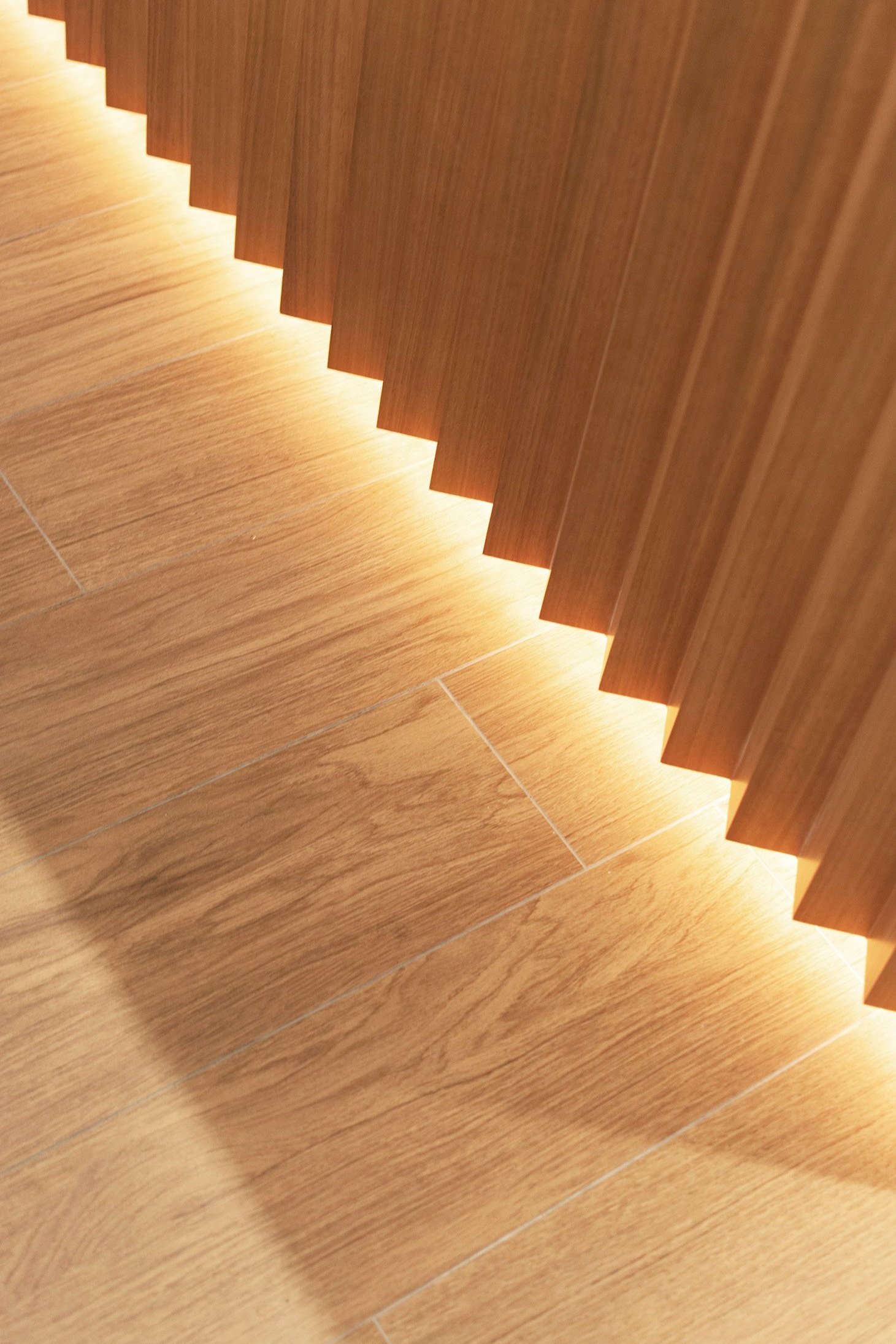
Inspired by the powerful works of the late modernistic Brazilian architect Oscar Niemeyer, we wanted to preserve the architectural characteristics of the space, where the structural beams in the ceiling slab form a diagonal grid across the open space. We inserted additional ceiling beams clad in stainless steel finish to express a sense of rhythm across the architectural space. Lighting is provided in between each ceiling fin, allowing light to fall through the fins on to the restaurant floor. This provides a strong spatial effect and identity for the restaurant.
The Composition: A Theatrical Space Performed by Chefs and Customers in an 'Airport'
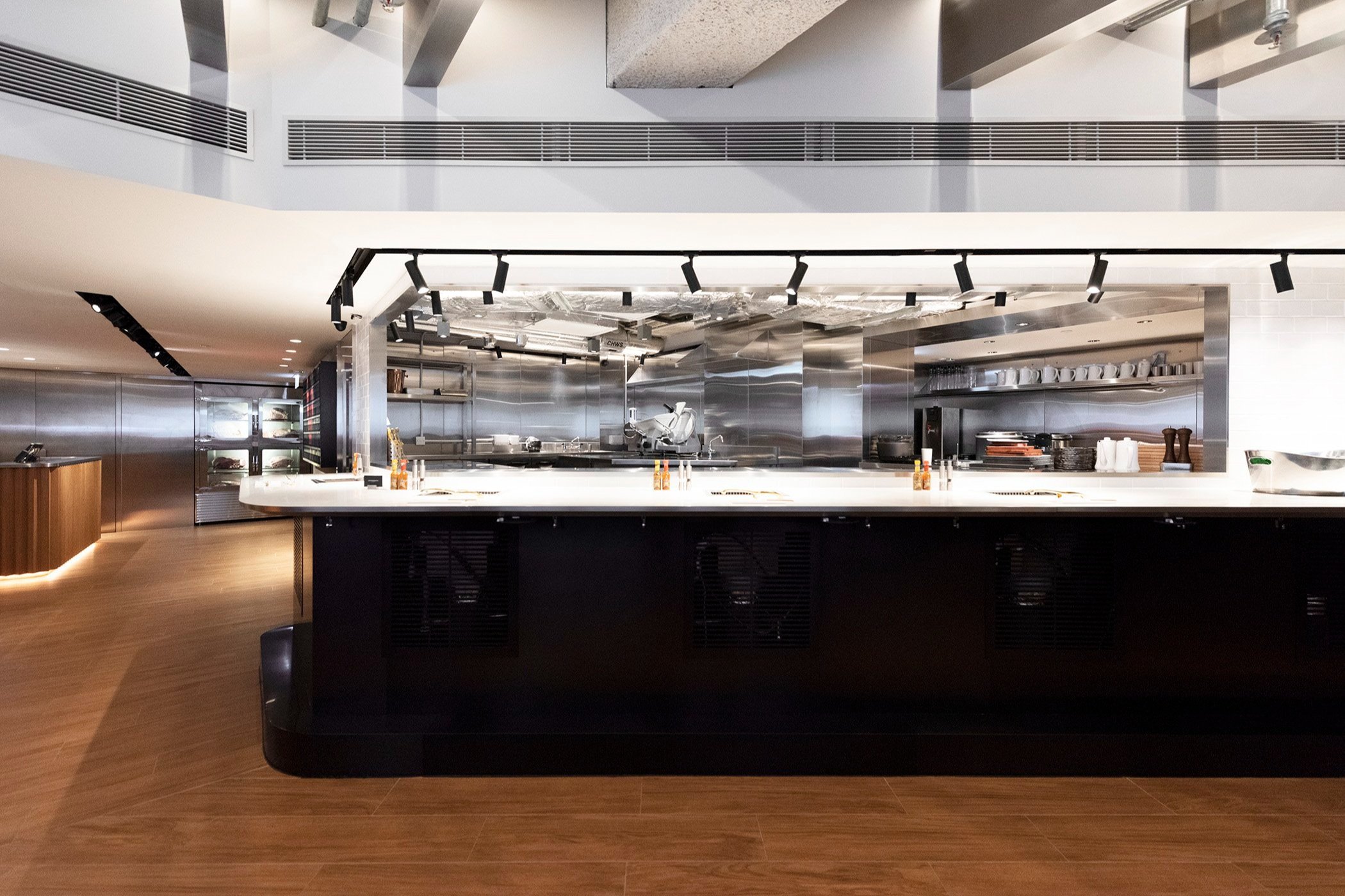
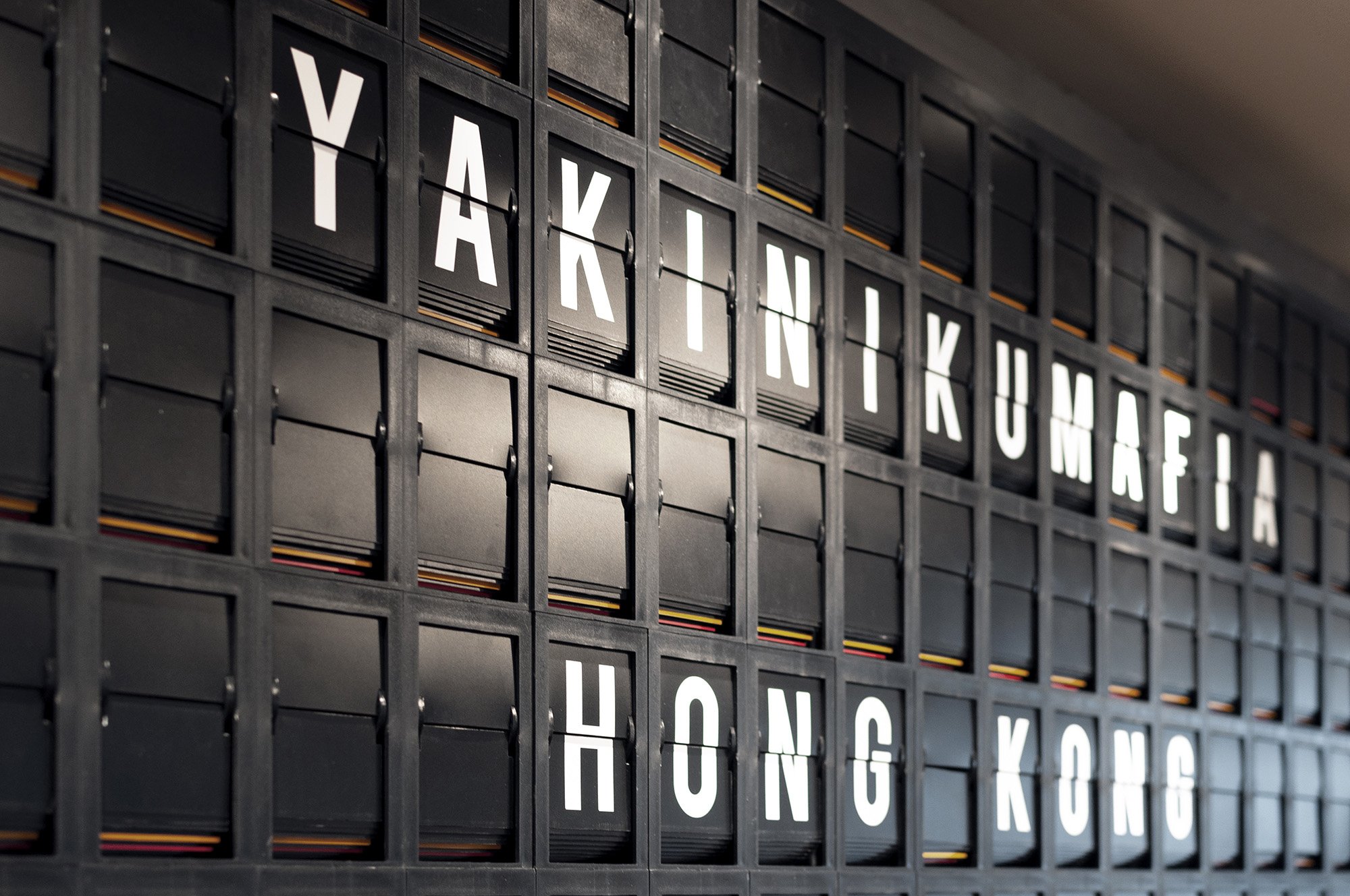
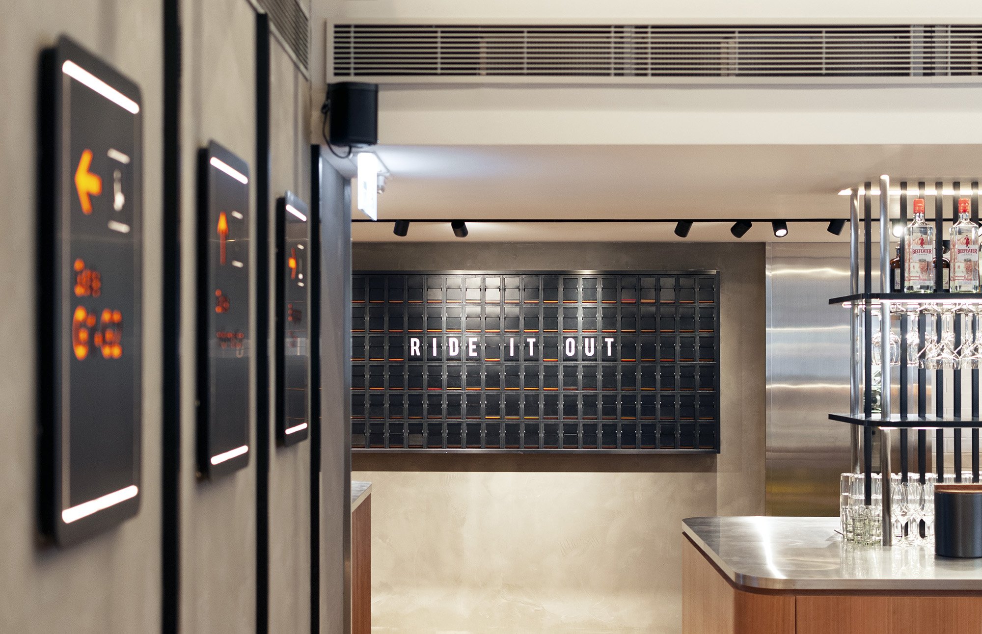
The entry reception consists of a wall of meat fridges, where customers can immediately see various cuts of wagyu beef on display. With beer taps installed, the reception desk itself also functions as a bar. The main feature in the reception space is an airport-inspired information flip board, where pricing of the different grades of beef is displayed. The message content flips in regular intervals and displays messages such as 'RIDE IT OUT', or tailored messages for customers such as birthday announcements. The central kitchen opens towards a standing bar, where chefs and customers interact. This central kitchen forms a theatrical backdrop for the open space of dinner booths which are set out along the perimeter facade of the building, where customers can enjoy natural daylight during the day, and be under the light-washed ceiling fins in the evening. Airport-inspired signages on metallic doors 'Gate 1 and 2' lead customers to the two VIP rooms concealed within. The two VIP rooms have an operable partition that can open up to adjoin together for more extensive functions.
The Materials: Stainless Steel & Timber
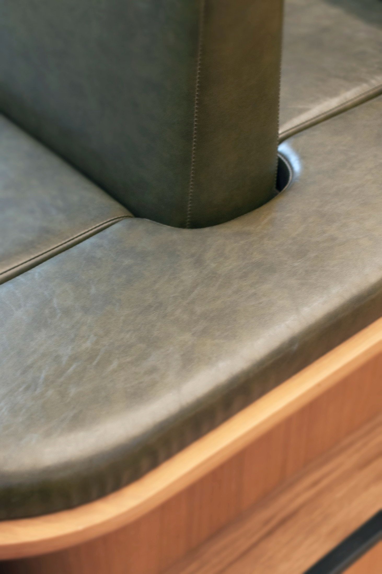
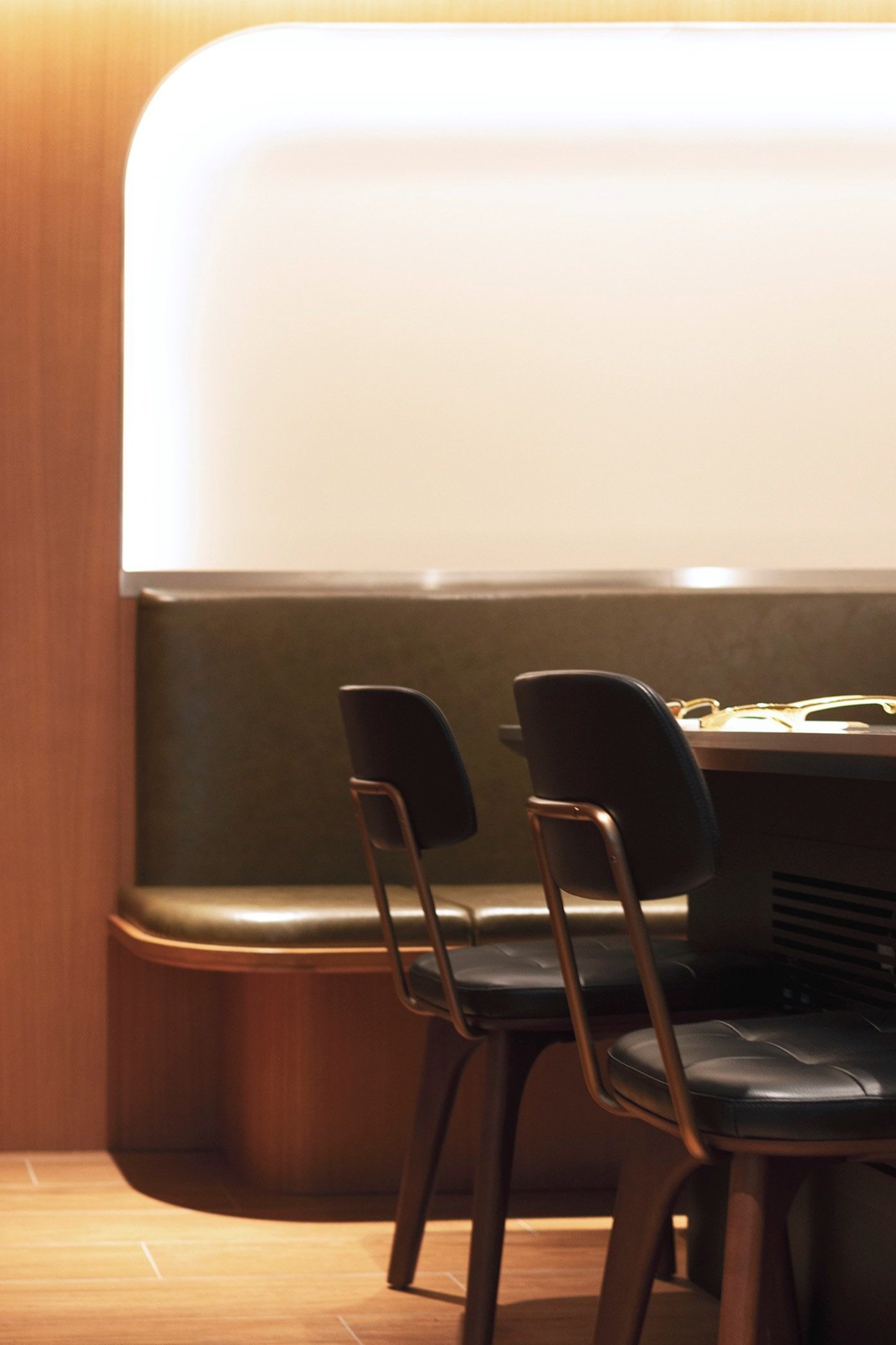
The mood and feel of the project was to be minimalistic, to allow customers to focus on the food in a powerful architectural setting. Hence, the finishes were kept neutral, with natural timber for the general flooring, joinery and cosy VIP rooms; stainless steel for the meat fridges, reception and open kitchen for a pristine 'laboratory-like' feel. The ceiling fins are clad in matte reflective stainless steel which allows the lighting to diffuse into space. Other secondary materials include white kitchen tiles, charcoal metal and a duck green leather for all seating, to establish a luxurious feel.
The Challenge: Environmental & Wellbeing design
A key design factor was the environmental challenge for this restaurant which consists of a large open kitchen and individual cooking grills provided for each customer seating throughout the restaurant. The restaurant must be well ventilated to prevent fumes and smell building up in the space. Local exhaust solutions are elegantly integrated into the custom tables, which allowed the design to do without the typical overhead exhaust hoods. Environmentally friendly materials were chosen wherever possible, and we limited the number of different materials used in the design to the bare minimum to cut down on construction wastage.

